Typography is one of the fastest ways a brand can feel generic or memorable. When many projects rely on the same widely used system fonts, visual difference shrinks. Independent type foundries exist to expand that range with original letterforms built for creative work — not as an afterthought to a larger software suite, but as the main craft.
Idealeksis is an independent type foundry and type design studio focused on distinctive digital typefaces for designers, creative professionals, and visual storytellers. The catalog spans expressive display styles, handwritten voices, graffiti energy, playful forms, and metal typography.
Why sameness shows up so quickly
Design timelines are short. Teams reach for fonts that are already installed, already licensed, or already “safe.” That is practical — and it is also why so many brands end up looking related even when their products are not.
An independent foundry changes the starting point. Instead of beginning with the same default library, you begin with a face that was drawn for personality. That single decision can shape packaging, campaigns, merch, and social identity for years.
What independent foundries actually offer
Independent foundries are usually smaller, more opinionated, and closer to the designers who draw the letters. That tends to mean:
- Original designs rather than slight variants of the same popular shapes.
- Clear stylistic direction — playful, metal, graffiti, handwritten, display — so you can shop by mood.
- Direct licensing paths for commercial projects, logos, web, and extended use.
- A catalog that grows with creative culture instead of only office defaults.
For Idealeksis, that means building typefaces that feel alive in contemporary visual culture: streetwear drops, music packaging, food brands, posters, and digital campaigns that need a stronger voice than a neutral UI font can give.
Playful voices for brands that should feel human
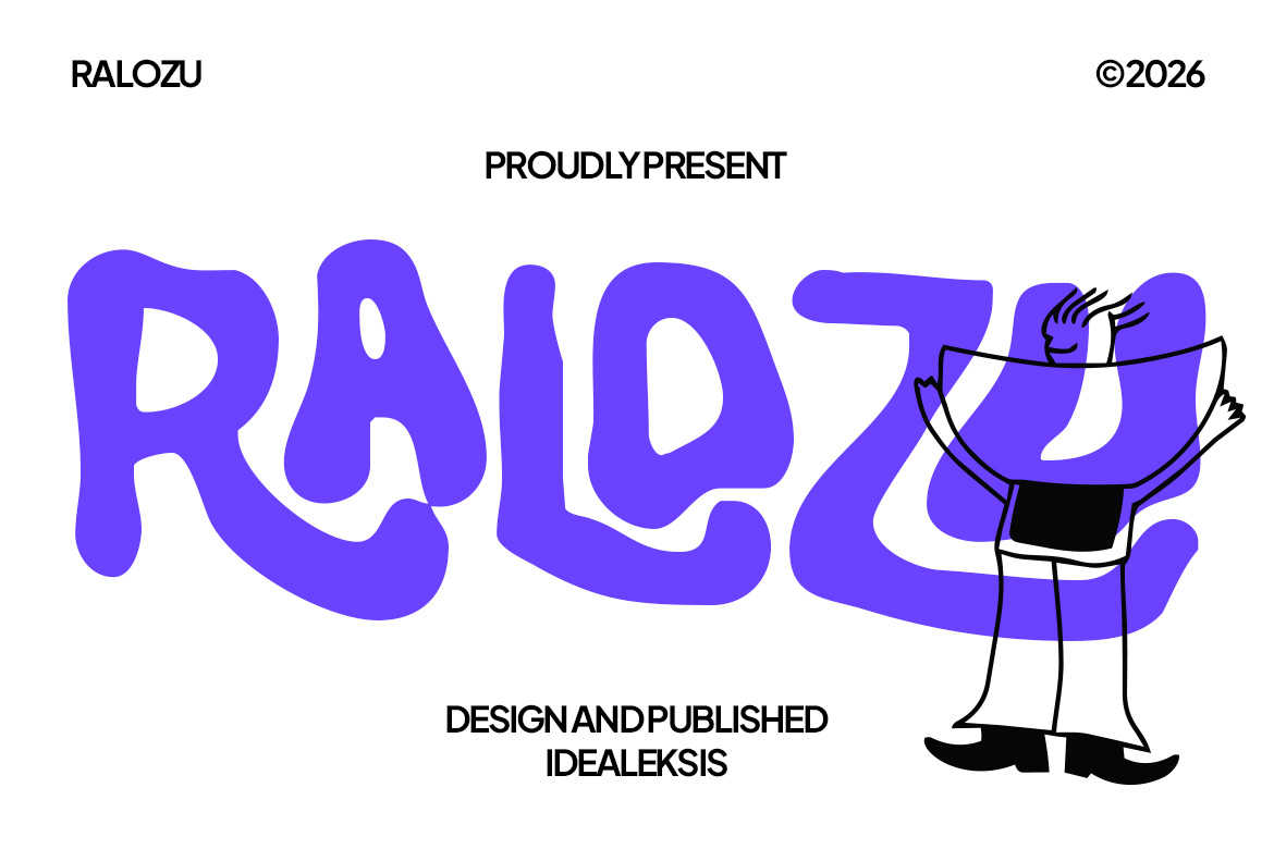
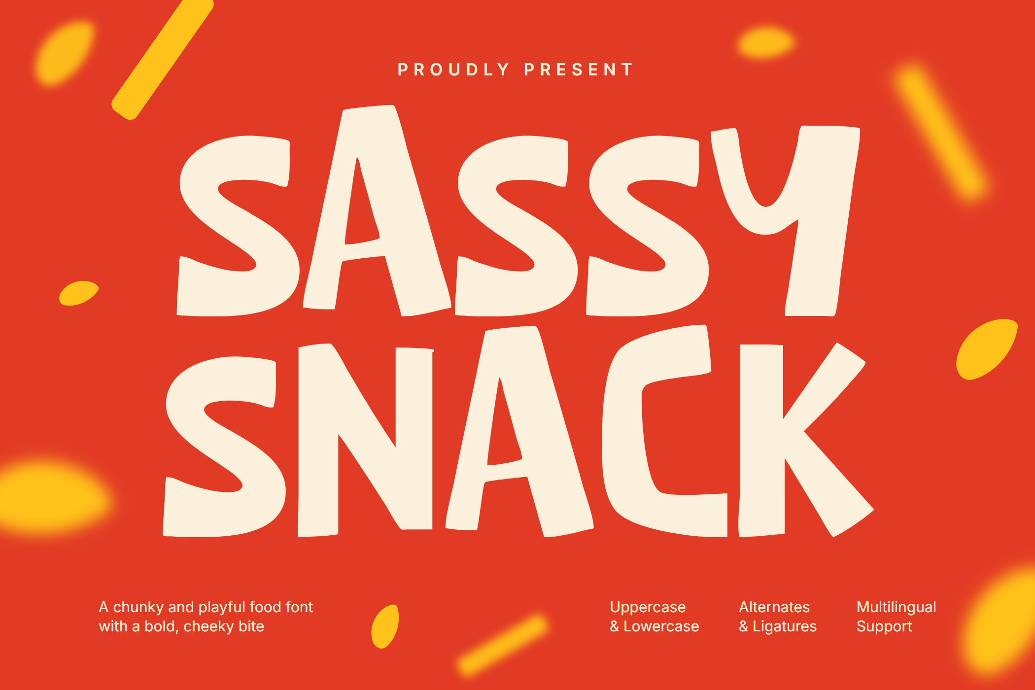
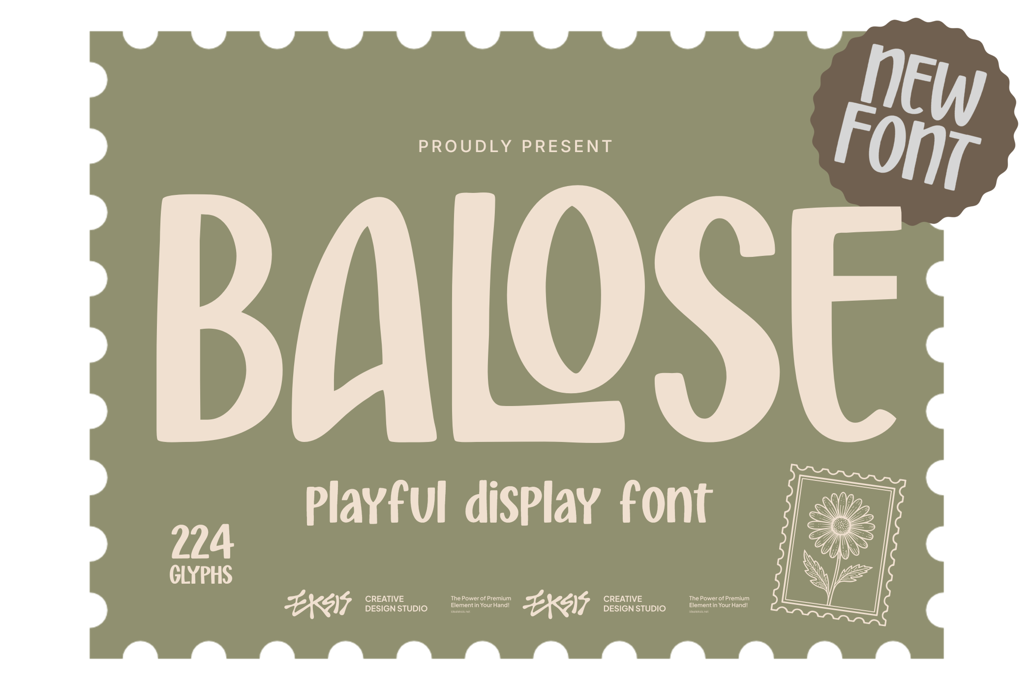
Not every brand needs severity. Snack labels, youth products, comedy platforms, and lifestyle launches often need type that smiles without collapsing into cliché. Independent playful faces give you that range without recycling the same rounded “fun” fonts everyone already knows.
Metal and street energy when the project needs edge
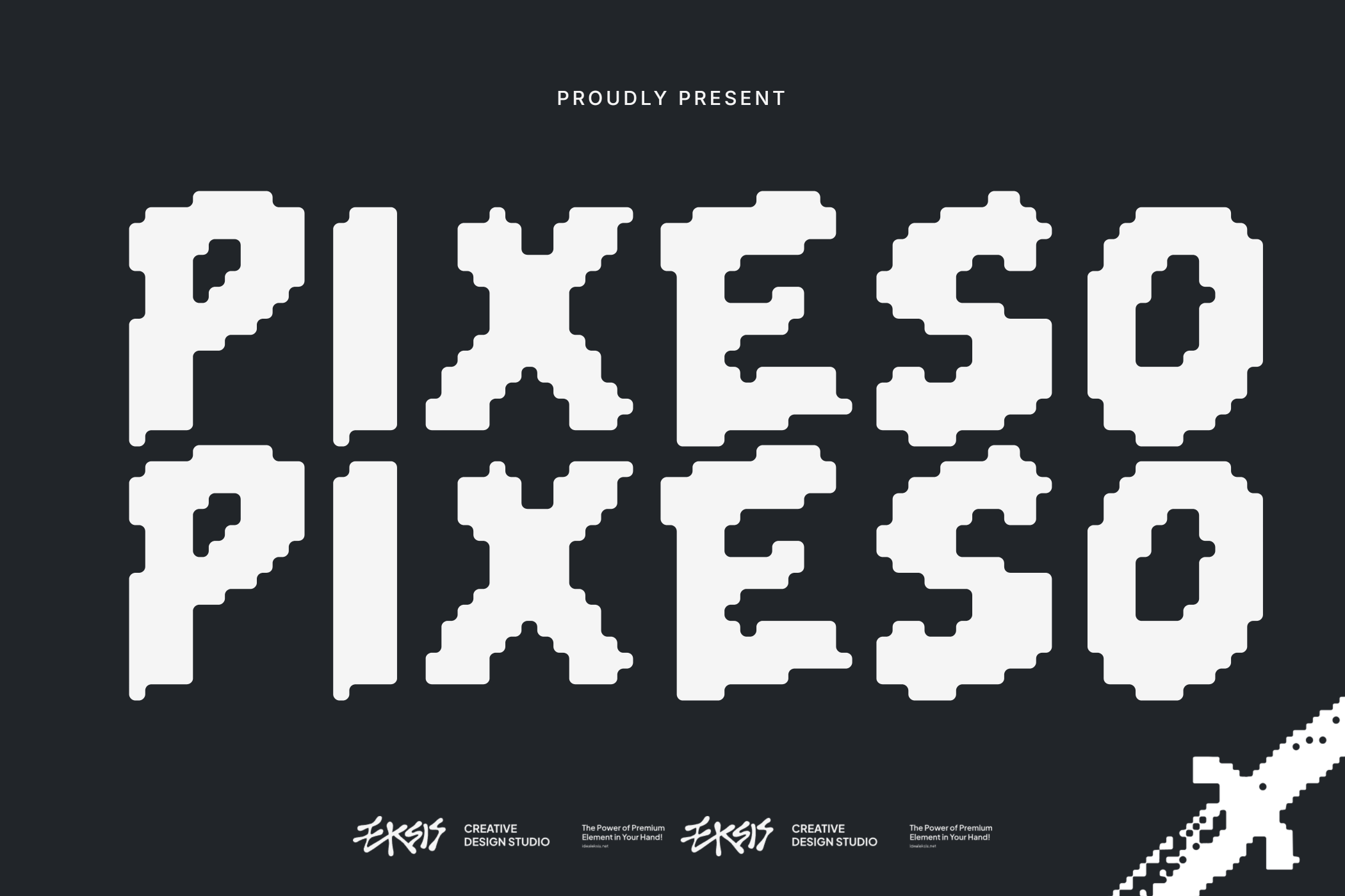
Other briefs need weight, grit, or night-time intensity. Metal and graffiti-inspired faces from an independent catalog help those projects avoid the “stock rock font” look that has already been overused across posters and album templates.
Display type as brand memory
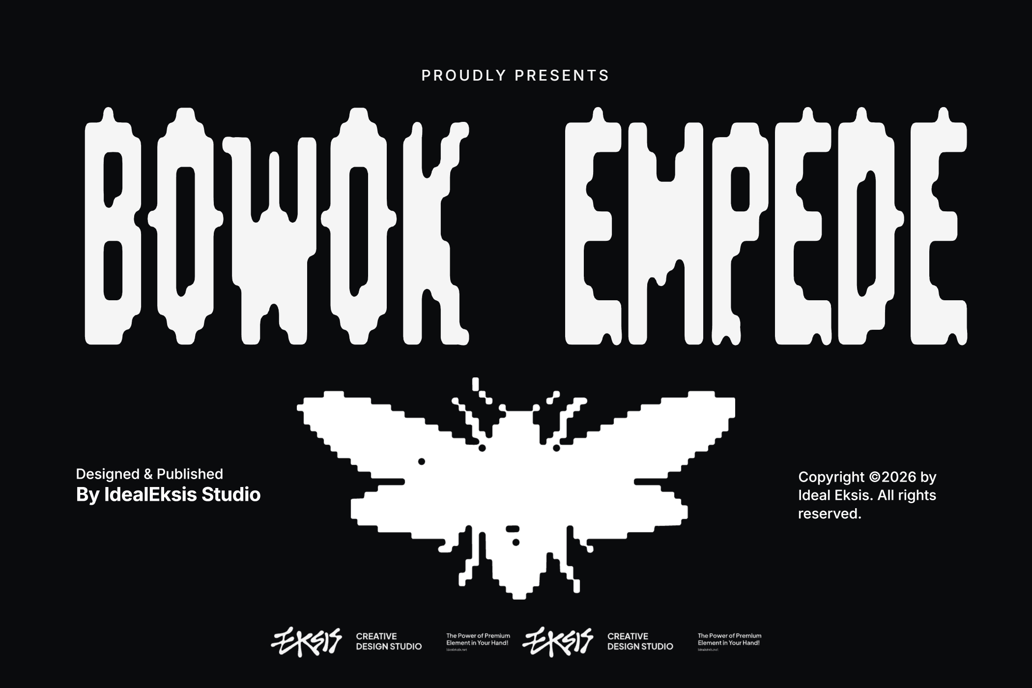
A strong display face can become a memory device. People may not remember a paragraph of marketing copy, but they remember a wordmark that looks unlike anything else on the shelf or feed. That is why independent display work matters for branding teams who want ownership, not rental of the same visual language as competitors.
Supporting creative teams, not only collectors
Foundry work is useful only if designers can actually apply it. That means clear specimens, a usable typetester, transparent licensing, and articles that explain when to choose one style over another. Independent studios succeed when they help creative teams make better decisions under deadline pressure — not when they treat fonts as abstract art objects.
Explore the catalog by mood in All Fonts, or go deeper with Display, Handwritten, and Metal Fonts: When to Use Each Style.
Choosing an independent typeface is a small decision with a long visual life. If the goal is work that feels authored rather than assembled from defaults, start with a foundry that designs for difference — then test the shortlist against your real words, real sizes, and real brand voice.