Display, Playful, Metal, and Handwritten Fonts: When to Use Each Style
Independent foundries often organize typefaces by visual attitude rather than only by traditional classifications. At Idealeksis, many releases fall into expressive families such as display, handwritten, graffiti-inspired, playful, and metal styles. Knowing when each direction helps keeps your typography intentional — and keeps you from forcing one mood into every project.
This guide maps those styles to real use cases, with Idealeksis typefaces you can open and test today.
Display fonts
Display faces are for short, high-impact text. Use them for titles, brand marks, posters, packaging hero lines, and campaign headers. They are usually too distinctive for long reading text, and that is by design.
Choose display when you need a face that can become part of the brand’s identity language. Check silhouette, spacing, and how the font behaves with the exact words you will print or publish.

Playful fonts
Playful typefaces add bounce, humor, and softness. They work for food brands, youth culture, entertainment, stickers, merch drops, and any identity that should feel inviting rather than formal.
Keep playful faces large enough to show their character. At tiny sizes, the fun details can turn into noise. Pair them with a simple sans for UI and body text so the playful voice stays special.
For more playful directions, see Pixeso, Chik Chuk, Edge Mixed, and Karbo.
Metal fonts
Metal styles bring weight, grit, and drama. They fit album art, festival posters, horror titles, streetwear drops, and brands that want a harder edge.
Use metal type in short bursts. A full paragraph of distressed letterforms is hard to read; a three-word title can feel unforgettable. Contrast metal headlines with cleaner supporting text so the aggression stays controlled.

Rocker Tantrum is a strong pick when the project leans rock, stage, or high-energy performance graphics. Browse more in the Metal Font collection.
Handwritten fonts
Handwritten and marker styles add human texture. They work for personal branding, lifestyle packaging, invitations, social captions, and any project that needs warmth or informality. Keep them large enough for the stroke quality to show, and avoid long paragraphs.
Graffiti and street lettering
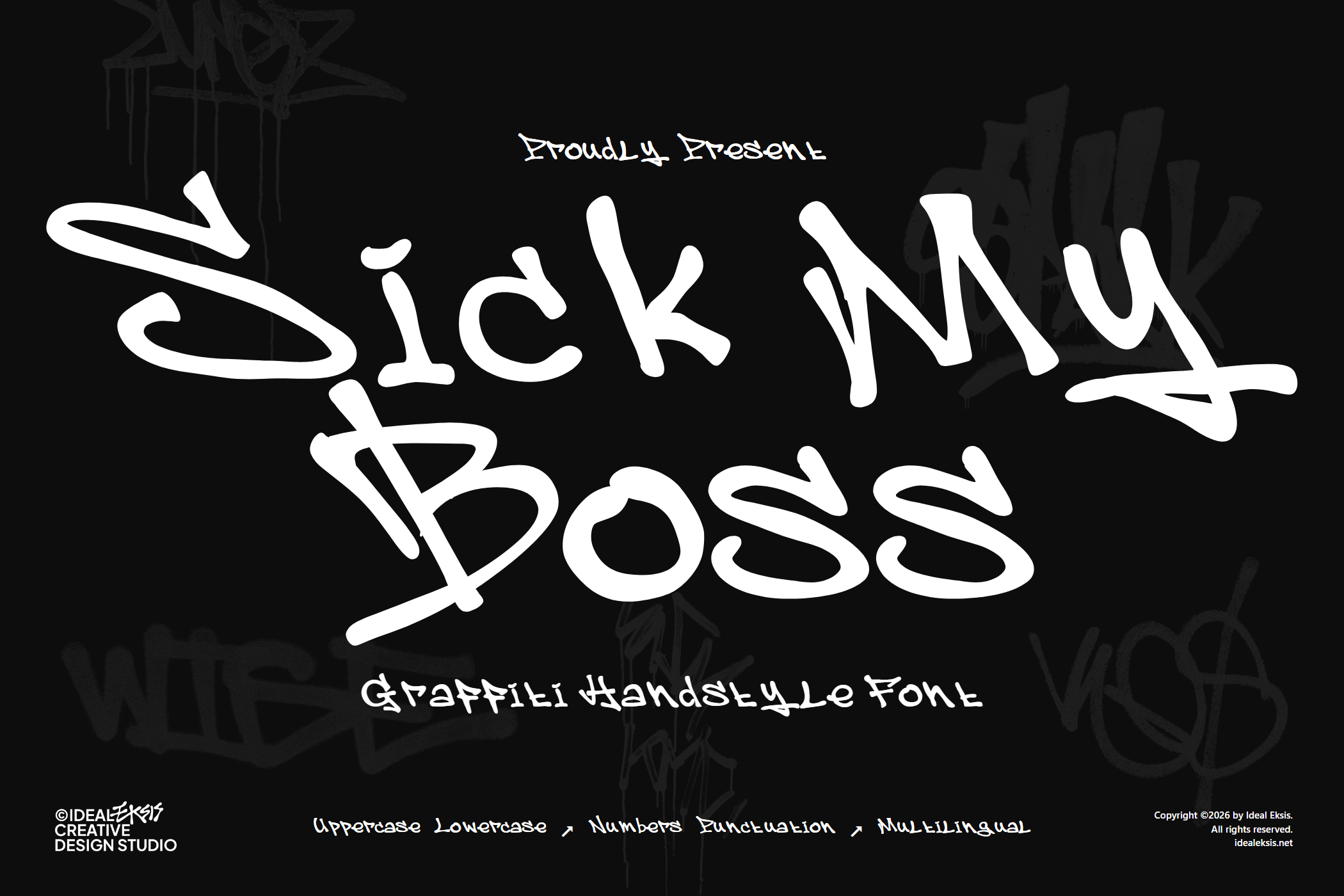
Graffiti-inspired fonts bring street energy, spray rhythm, and urban attitude. They suit streetwear, skate, music, mural-led campaigns, and youth culture brands. Like metal and playful faces, they perform best as headlines and short phrases.


How to choose quickly
- Need shelf or logo impact? Start with display.
- Need warmth and personality? Start with handwritten or playful.
- Need aggression or nightlife energy? Start with metal.
- Need street attitude? Start with graffiti.
Still deciding for a brand system? Read How to Choose a Display Font for Branding, then test candidates in the Typetester.
Whatever style you pick, keep the role clear: one expressive face for the moments that should be remembered, and calmer type for everything people need to read comfortably.