How to Choose a Display Font for Branding
Display fonts are built for impact. They carry personality at large sizes, which makes them useful for logos, posters, packaging, campaign headlines, and short brand statements. The challenge is choosing a typeface that feels distinctive without fighting the rest of your visual system.
Start with the job the font has to do. A logo mark needs a strong silhouette and recognition. A packaging headline needs shelf presence. A social campaign needs energy that still reads quickly on a phone screen. When the use case is clear, style decisions become easier — and you can match the voice of the brand to the right family in the Idealeksis catalog.
Match character to brand voice
Playful rounded forms suit youth-facing or lifestyle brands. Angular or distressed metal styles fit music, streetwear, and darker visual worlds. Handwritten faces feel personal and informal. High-contrast or unusually constructed display faces work when you need a signature look that still holds a logotype.
Write three words that describe the brand voice before you browse fonts. If the words are “friendly, soft, curious,” a sharp metal face will fight the brief. If the words are “loud, nocturnal, heavy,” a cute playful face will feel wrong no matter how well drawn it is.
When the brief asks for playful
Playful typefaces help brands that sell snacks, kids’ products, comedy, social apps, or anything that should feel approachable without becoming childish. Look for bounce in the curves, unexpected joins, and a rhythm that still holds at a glance.

Also consider Shisu Comik, Edge Mixed, and Karbo when you need comic energy, mixed rhythm, or a more graphic playful mark.
When the brief asks for metal
Metal typography is for intensity: music packaging, horror titles, motorcycle culture, dark fashion, gaming launches. The letterforms should feel carved, welded, or worn — not merely bold. Test them large; metal faces often live or die on silhouette.
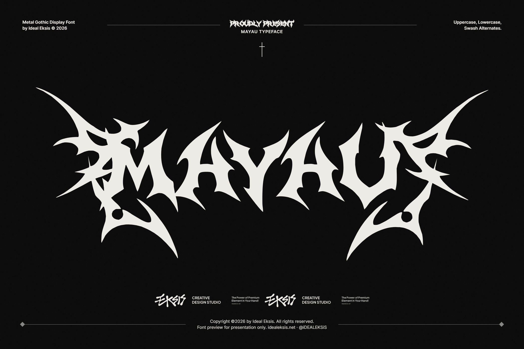


Santone is another strong option when you want a denser, more industrial metal presence.
Test at real sizes
A display face that looks powerful in a specimen can collapse in a tiny favicon or overcrowd a short logo lockup. Always set a few real words from the brand — product name, campaign line, event title — at the sizes you will actually ship.
- Logo / wordmark: check recognition at both large and reduced sizes.
- Poster / packaging: check rhythm across 2–6 words.
- Social crop: check clarity in a square and a vertical story frame.
Use the Idealeksis Typetester to paste your own copy before you decide.
Pair with a quieter text voice
Display fonts rarely carry body copy. Pair them with a neutral sans or serif for paragraphs, UI, and secondary labels. Keep the expressive face for the moments that should stop the eye; let the supporting type keep reading comfortable.
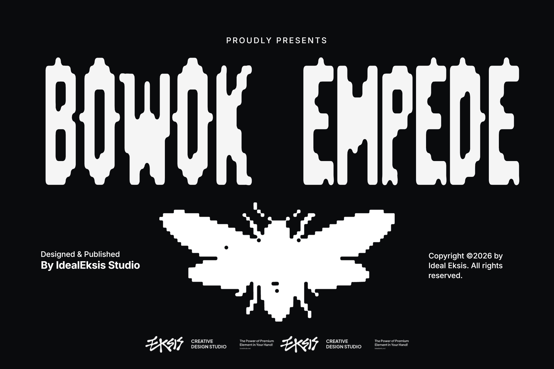
Other branding-ready display directions include The Great Kingdom and Kopiers Break when you need a more graphic or disruptive headline voice.
A short selection checklist
- Can you describe the brand voice in three words?
- Does the font match that voice at a glance?
- Does it still read in the smallest size you need?
- Does it leave room for a calm text pair?
- Is the license right for logos, packaging, or web use?
Licensing tip: branding work that includes logos, packaging lines, or multi-channel campaigns often needs more than a basic desktop seat. Read Standard vs Extended Font License and the Licenses page before you finalize.
If you already know the mood — playful, metal, handwritten, graffiti, or classic display — browse those directions in the All Fonts catalog and shortlist two or three faces to test against the same headline.